Duolingo - 20 days of emotional blackmail from Duolingo 多鄰國20天的召回資訊轟炸
超過一半多鄰國使用者堅持每週學習。我卻不是。我總是收到各種狂轟濫炸的召回郵件和推送,催我回到應用。這些訊息簡直瘋狂。
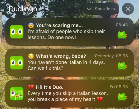
多鄰國時而像個粘人的戀人,時而又像嚴厲的監督者。商業內幕評價它是"應用商店最刻薄的應用",使用者稱它"失控"和"虐待人"。為了讓使用者繼續學習,他們甚至推出了內衣系列。雖然這種風格引起爭議,但很多Z世代使用者很喜歡。FastCompany的報道證實了這一點。
這種營銷策略確實有效:2023年80%的使用者透過自然渠道獲得。營銷總監Katherine Chan去年說:"我們的使用者增長很大一部分來自於使用者在抖音上看到我們。"
這個廣受歡迎的貓頭鷹形象在社交媒體上迅速傳播 🦉
資料顯示,他們第二季度的日活躍使用者和收入都有顯著增長。我想深入瞭解這隻貓頭鷹是如何影響使用者體驗的,特別是他們的電子郵件營銷策略。
讓我們分析Duo的歡迎郵件序列:
- 郵件傳送頻率和變化
- "提醒"郵件的效果
- 激勵性內容的變化趨勢
- 郵件模板的變體應用
讓我們從頭開始分析。
How Duolingo changed its messaging: From guilt trips to fun reminders 多鄰國的變化:從催促學習到有趣提醒
Klarna設計主管Ben Davies-Romano分析了多鄰國的新使用者郵件,發現早期郵件用"讓小貓頭鷹開心"這種類似父母責備小孩的語氣。現在郵件變得友善了,主要關注三個方面:
- 堅持學習:前4封郵件中3封鼓勵每日學習,利用使用者不願失去已有成果的心理
- 短小課程:強調課程簡短,解決使用者"沒時間"的問題
- 感情激勵:用"你不想學了嗎?"、"你的語言技能在退步"這樣的話,來鼓勵使用者重新開始學習
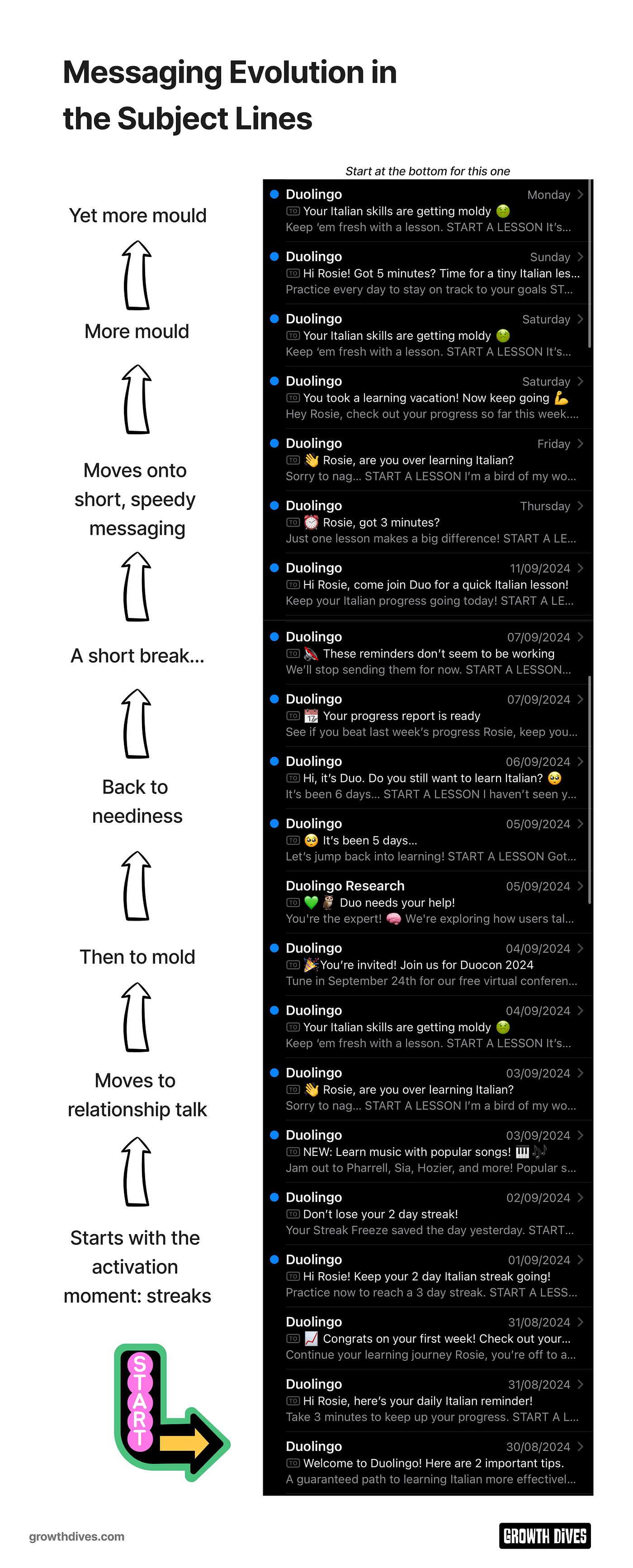
近兩年,Duo採用了三種主要的溝通方式:
- 互動提醒:用"你還在學習嗎?"和"要放棄了嗎?"這樣的提示
- 學習提醒:提醒使用者"知識在退步"和"繼續保持學習"
- 課程提醒:強調"只需3分鐘"和"快來學習"
他們用不同的說話方式,有時認真,有時活潑,都是為了引起使用者的感情共鳴。每封郵件都只有一個簡單的"開始學習"按鈕。他們的設計重點是:打動人心的提醒😭 簡單易用的介面🧠
下面我們來看看這些提醒是什麼時候傳送的。
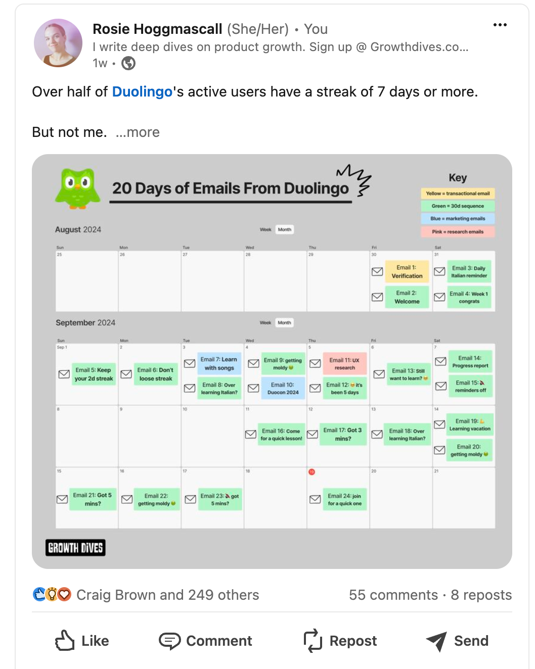
Email cadence: Max 2 per day 郵件傳送節奏:每天最多2封
這20天中,我總共收到了這些郵件:
- 3封提醒我"知識正在變質"的郵件
- 2封說"看來這些提醒不起作用"的郵件
- 2封活動通知(關於多鄰國舉辦的活動和新音樂功能)
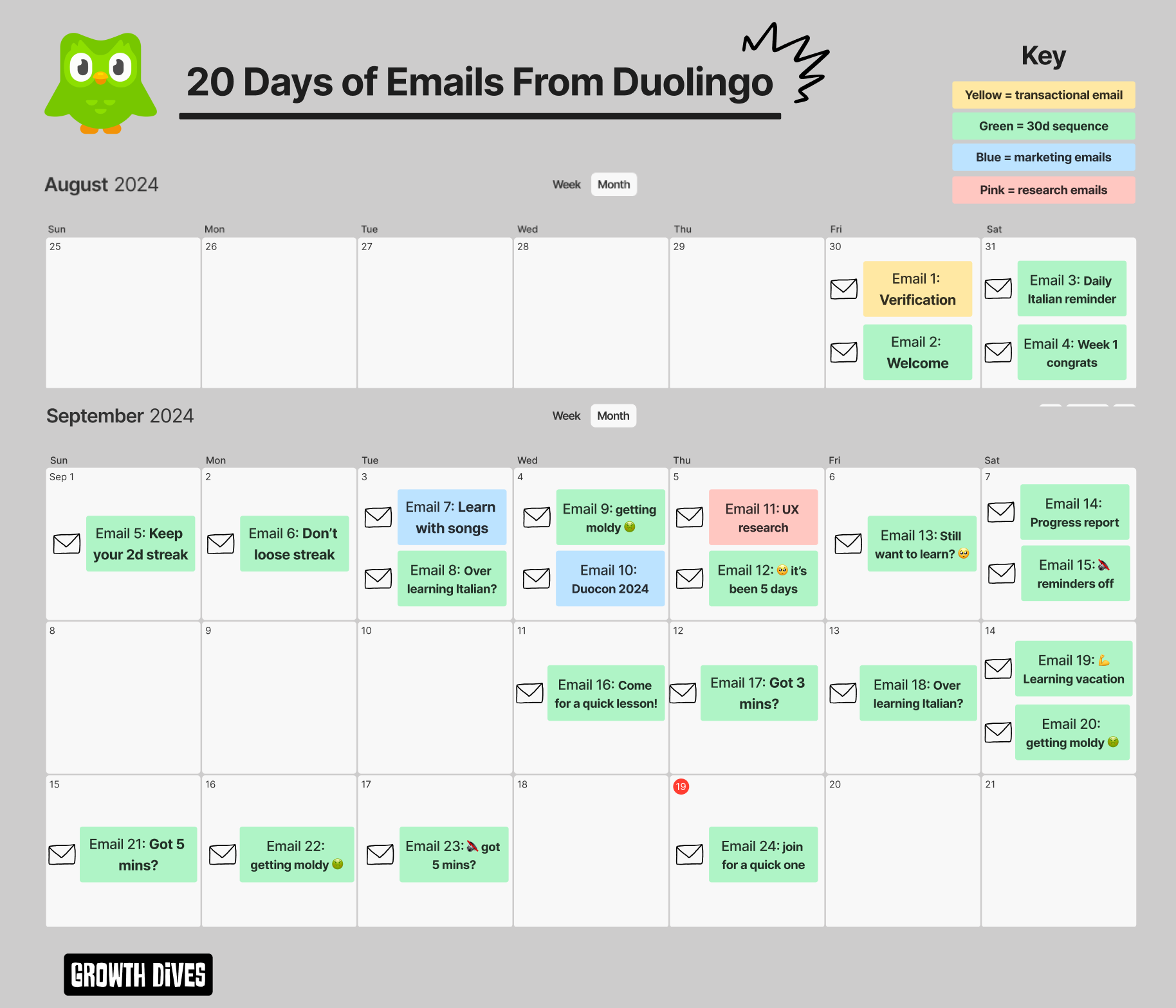
What’s interesting is that I received no more than 2 emails per day. And thankgod.
Given the emails are so intense, more than two per day would likely have led to an unsubscribe.
With CRM strategy, typically1 email per day is seen as the max.
It’s also recommended to send more emails in the early days and then ease off later. Why? Well, you want to capitalise on the early momentum and motivation from users. Push them through.
You want to ensure there are enough touch points in the first 0–7 days for the user to remember you’re there, build trust and push to the activation moment.
This roughly means 1 per day for 3–4 days, then one every second day for a week.
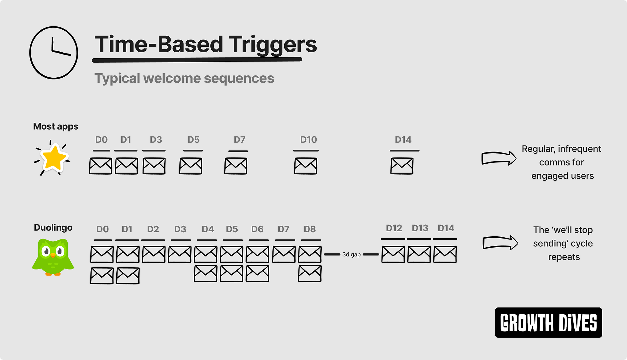
Duo takes this one step further by sending12 emails in the first 6 days.
We get a breather after their famous email:
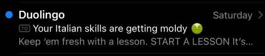
🔇 These reminders don’t seem to be working
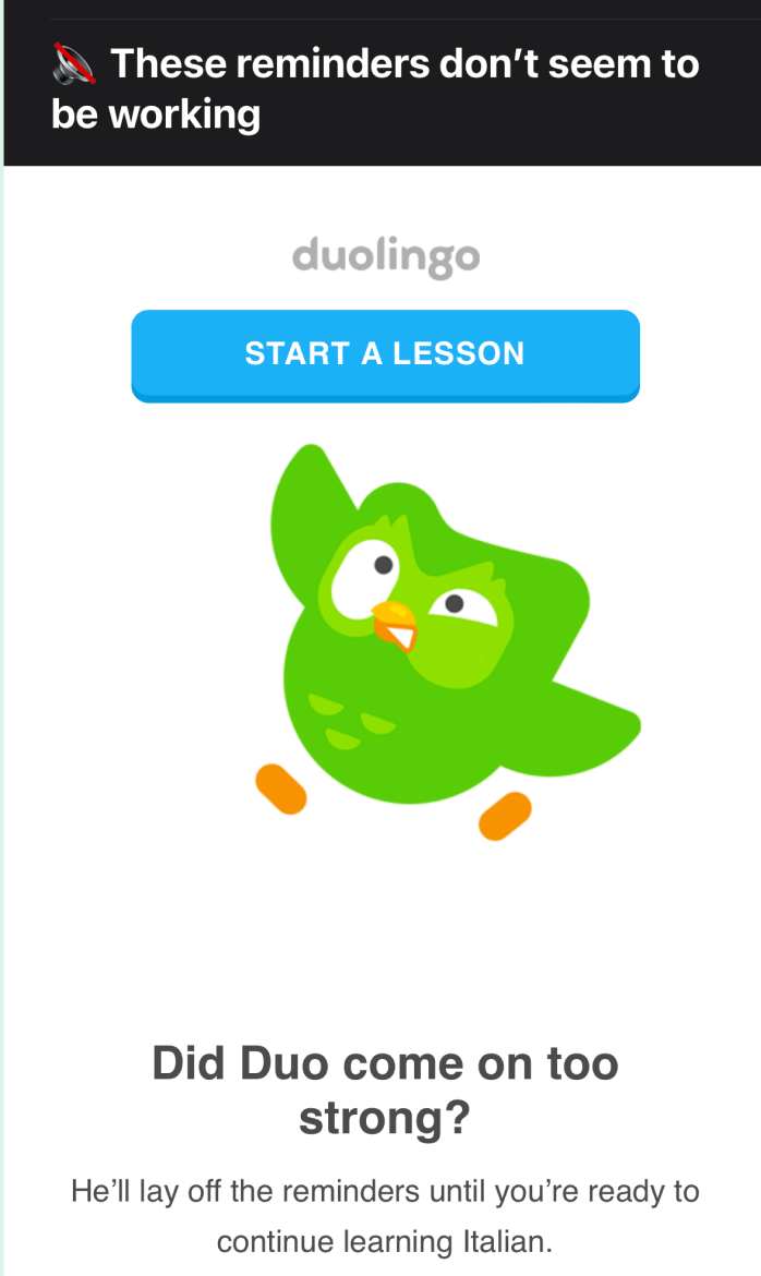
However, this only lasts 3 days before the reminders start again.
Turns out Duo decides when I’m ready to start learning Italian again.
Curiously, after the 1st 🔇 email on day 8, I get a second ‘reminders off’ email on day 18. But different. The reminders stopped for 3 days in the first case, and only 1 day in the second case.
Seems likesomeoneis getting impatient.
What’s clever here is how the template is re-used over and over. And over. And over.
So, onto design.
An incredibly simple email template
The template is smart. Very smart.
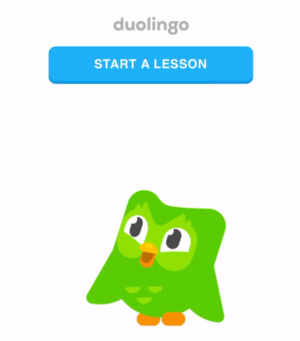
First up the CTA is the first thing under the logo.
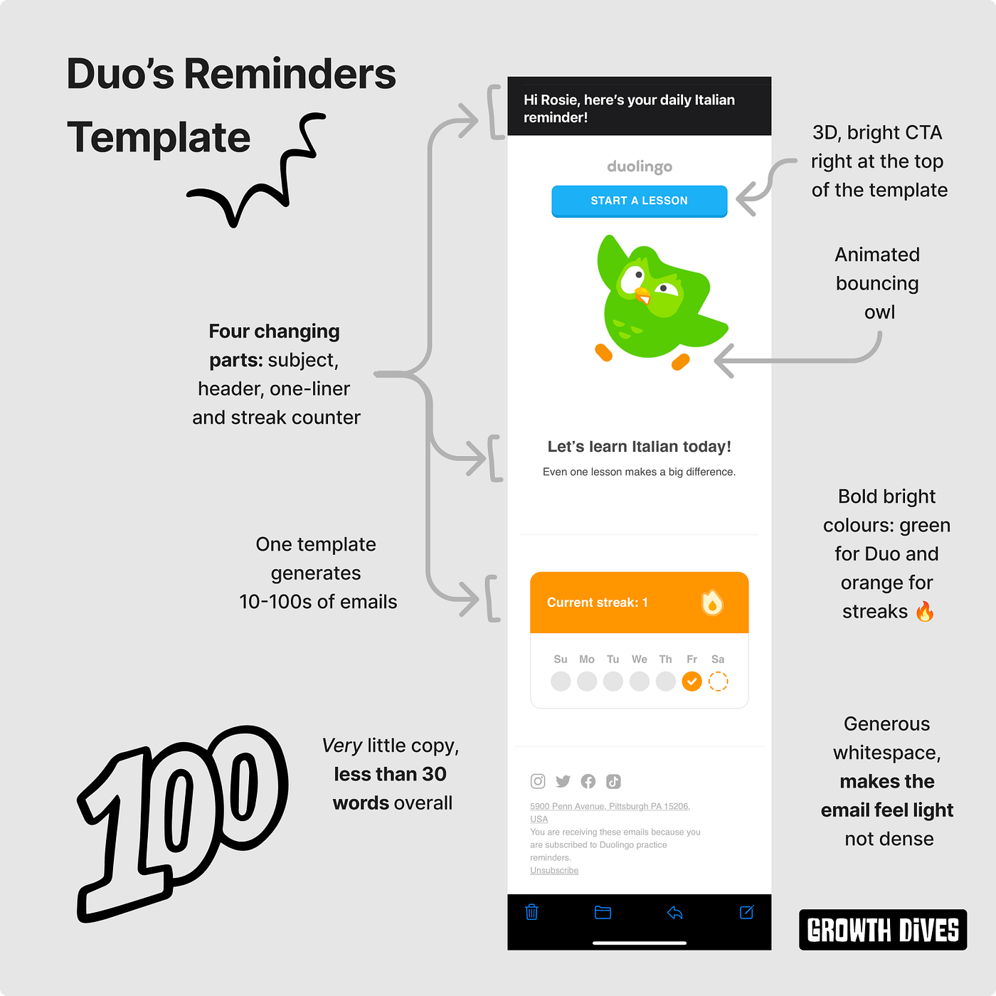
Meaning that it’s always easy to jump back in.
Secondly, the animation of Duo issoentertaining.
Such a bouncy guy.
When you look at the welcome emails side-by-side, it’s clear that four parts of the email change:
- The subject
- The header
- The 1–2 liner under the header
- The streak counter
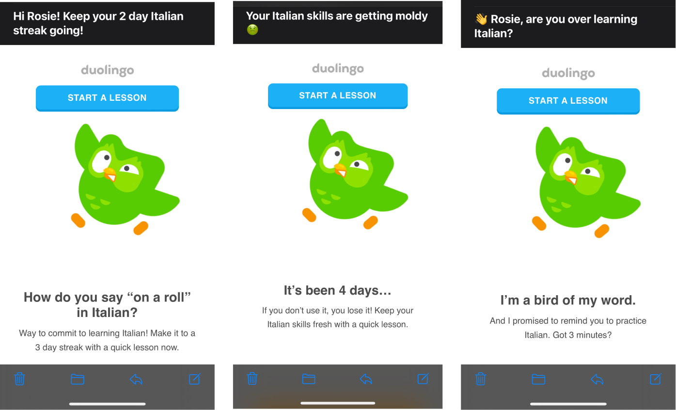
This means the team can produce these emails at scale, testing the parts that drive better open or click-through rates.
When you look atallthe emails together (scrunch your eyes here), what do you see?
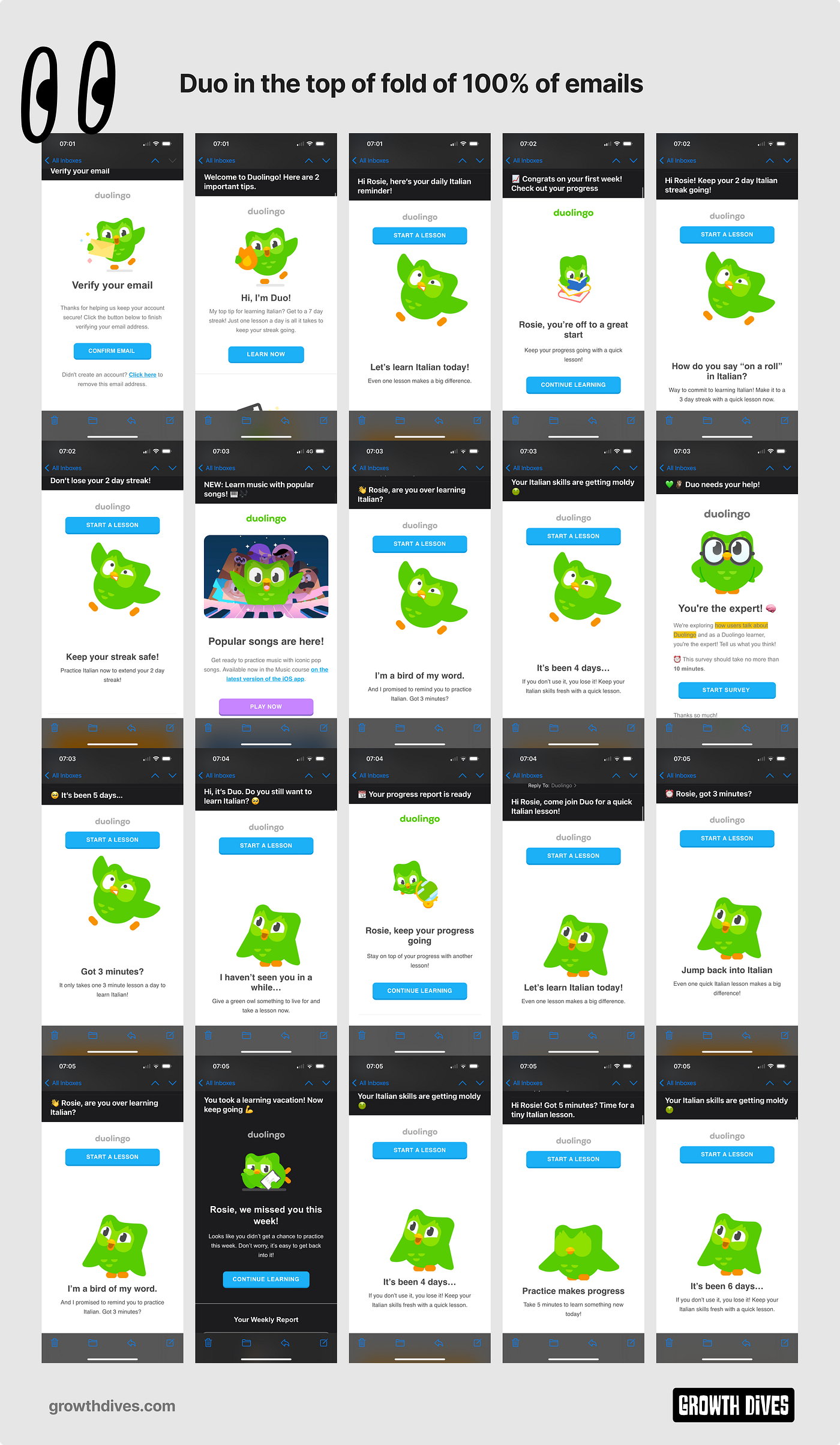
What I see is a lot of owl.
So. Much. Owl.
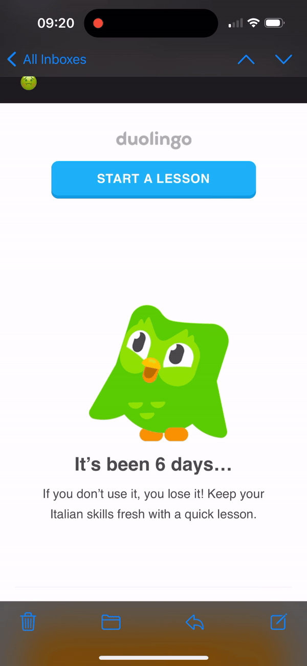
Duo is in 100% of the emails. Not just that, but in the top of fold.
It’s key for the brand to have the character front-and-centre in all emails. For me, the email top of fold such a valuable piece of real estate.
The thing that stands out most is how simple the email is. No fuss, same GIF. Every time.
It’s harder to strip things out than put them in. And it’s clear here the team have spent time creating emails that pack a punch visually and through language (in good and bad ways).
So, what’s the verdict — Emotionally damaged or just amused?
For me, amused.
I don’t feel too damaged after this email flow.
I like that the messaging has toned down from the ‘keep the owl happy’ threat-like language to the more entertaining relationship play and mouldy food. Which is gross, but fun.
All in all, there’s some learnings we can take away here. Duo did well:
- Starting with the magic momentof streaks, to try and reduce time to value and get people hooked
- Using emotion to break throughwithentertaining subject lines that weren’t afraid to go off-piste and take up different personas throughout the same flow
- Using a template that’s fast to iteratewith subject lines, headers and text that can swapped out
- Simplicityof the CTA, to reduce the cognitive load for the user of what action to take next. Just ‘take lesson’
- Easing up sometimesby pausing the comms (even if only for 1–3 days). Which means that the next email that comes through hits harder
What emails are in your inbox from Duo?
Hi, I’m Rosie 👋 I write weekly deep dives on product, growth and UX. Sign up togrowthdives.comfor more🕺 Enjoy!
Join the conversation on LinkedInhere.
Hi, I’m Rosie 👋 I write weekly deep dives on product, growth and UX. Sign up to growthdives.com to get a deep dive to your inbox each Friday
2022年,我的朋友Ben Davies-Romano(現任Klarna的使用者體驗與內容設計主管)分析了註冊後20天內收到的所有多鄰國郵件。
Ben注意到早期郵件流程中經常使用"讓貓頭鷹保持開心"這樣的措辭,他說:
這開始讓人感覺像是一種家長式的情感勒索,旨在打擊我的學習動力,就像那隻綠色貓頭鷹在說"你沒有按承諾學習,我對你很失望。"太戲劇化了?確實如此。
有趣的是,我認為他們已經收斂了一些(至少在郵件方面)。
我現在已經看不到任何要求讓Duo保持開心的文案了。
取而代之的主題是(按出現順序):
- 強調連續學習:前4封郵件中有3封在頂部提到連續學習——目的是減少價值實現時間,讓使用者接觸這些高留存率功能 🧠 利用了損失厭惡心理,讓使用者不願失去連續打卡記錄
- 在連續學習之後,Duo推廣"快速"、"短"、"3分鐘"課程:在啟用環節之後,他們針對"沒有時間"這一痛點,強調課程有多簡單。
- 最後是釜底抽薪:直接發問"你是不是不想學了?"以及"你的技能正在發黴"這樣的說法確實戳中痛處。這些都是為了激發情緒反應,讓你擺脫現狀
2022年,我的朋友Ben Davies-Romano(現任Klarna使用者體驗與內容設計主管)分析了註冊後20天內收到的所有多鄰國郵件。
Ben注意到早期郵件流程中經常使用"讓貓頭鷹保持開心"這樣的措辭,他說:
這開始讓人感覺像是一種家長式的情感脅迫,專門設計來打擊我的學習動力,就像那隻綠色貓頭鷹在說"你沒有按承諾學習,我很失望。"太戲劇化了?確實如此。
有趣的是,我覺得他們已經收斂了一些(至少在郵件方面)。
我現在已經看不到任何要求保持Duo開心的文案了。
取而代之的主題是(按出現順序):
- 強調連續打卡:前4封郵件中有3封在頂部提到連續打卡——目的是縮短價值實現時間,讓使用者接觸這些高留存率功能 🧠 利用了損失厭惡心理,讓使用者不願失去連續記錄
- 在連續打卡之後,Duo推廣"快速"、"短"、"3分鐘"課程:在啟用環節之後,他們針對"沒有時間"這一痛點,強調課程有多容易完成。
- 最後是釜底抽薪:直接問"你是不是不想學了?"以及"你的技能正在發黴"這樣的說法確實戳中痛處。這些都是為了激發情緒反應,讓你擺脫現狀